Choosing Colors that Reflect Your Office Brand
February 13, 2020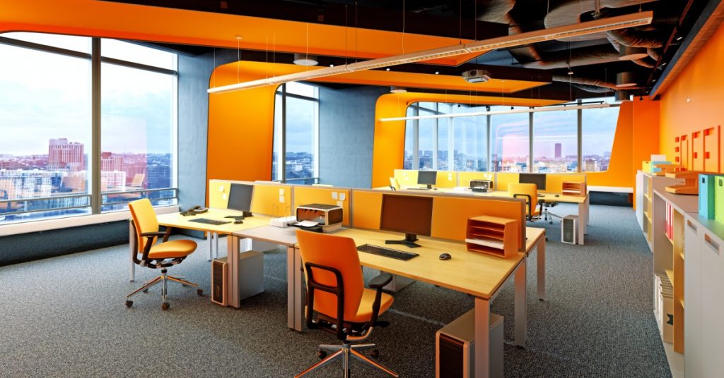
The office space needs a redo. You’ve chosen the desks, the chairs, that striking conference table or trendy couch for your waiting area. Now it’s time to slap some neutral paint on the walls and call it a day.
Not so fast! Did you know color is incredibly important when it comes to creating an atmosphere that reflects your company’s image?
Here’s how choosing the right colors for your space can help represent your company’s brand in the best possible way.
Colors and Emotions
There’s a reason why fire hydrants are bright red while your dentist’s office is not. Red can invoke feelings of excitement or alarm, and no one wants a blood pressure spike while they’re having their teeth checked!
Colors tap into our emotions, and we also attach meaning to colors. We associate red with speed (racing cars), white with cleanliness (hospitals), pink with femininity (baby dresses). Yet colors are so much more complex, evoking many feelings and images. Use these guidelines for colors and their associations to choose shades that represent your brand and blend with your office furniture.
White
Associated with sterility, cleanliness, and innocence, white conjures up feelings of goodness, safety, protection, and softness.
Medical facilities and spas are well known for using white. Bright white makes trim pop and ceilings appear higher.
Yellow
Invoking images of the sun, yellow is associated with confidence, success, clear-headedness, and swift decision making.
Industries that incorporate yellow include travel and leisure, food, and sports.
Orange
This blend of yellow and red inspires creativity, enthusiasm, adventure, and optimism.
Companies in the fields of sports, entertainment, food, and transportation often use orange in their logos.
Red
 This color of passion and danger incites excitement and energy, as well as courage and strength.
Children’s products, medicine, and sports, as well as the food and entertainment industries all use red for its attention-grabbing quality.
Pink
Not only does pink evoke feelings of love and compassion, but it’s also playful, lighthearted, and nurturing.
Fashion, beauty, and women-oriented industries commonly use shades of pink.
Purple
A royal hue associated with luxury and high quality, purple evokes mystery, imagination, sensitivity, self-awareness, and compassion.
Religious organizations, along with humanitarian groups, often use purple in their décor.
Blue
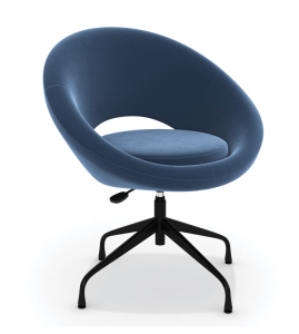 Blue conjures up images of summer skies and calm waters. Associated with feelings of loyalty, confidence, responsibility, serenity and peace, it’s very versatile.
This “true blue friend” color of constancy works well in finance, healthcare, tech, and security arenas.
**Color Trend Alert** Pantone, famous for its color matching system, recently released its 2020 color of the year: classic blue, which reflects the transition to a new decade, connoting a dependable and stable foundation. You’ll see blue in everything from paint and furniture to clothes and even lipstick!
Green
Synonymous with “eco-friendly,” the imagery of green grass and fields strikes a chord with emotions like stability, harmony, revitalization, relaxation, and reliability.
In addition to farming and environmental industries, real estate firms and nonprofits often use green.
Brown
The color of the earth is a warm color that evokes feelings of honesty, reliability, and comfort.
Agriculture, legal, transportation, and food industries frequently use brown.
Grey
Shades of grey have been trending for several years! It creates feelings of maturity, protection, practicality, and quietness. This neutral is another option for black or white.
Grey is universal to all industries and is typically used with other colors.
Black
While black sometimes has negative connotations of fear and pessimism, it also evokes strong feelings of elegance, discipline, authority, and power.
Like grey, black is used in all industries!
**Furniture Color Tip** Black makes a striking accent color with almost any color scheme. Metal, cherry, and white office furniture work especially well with black.
 Choosing Colors for New and Existing Furniture
New Furniture
Once you’ve decided on colors for the space, choose furniture that will complement your color scheme.
- Define your brand’s style. Are you conveying a modern, hip vibe or a traditional atmosphere? Should your space be inspiring and exciting or calm and confident?
- Pay attention to materials. Wood, fabric, and chrome are extremely versatile, giving you lots of paint choices.
- Don’t be afraid to mix and match! Your furniture can be a combo of wood and metals, or you might want to select hues and finishes that blend with your overall color scheme.
Existing furniture
Don’t panic if you need to paint but you’re keeping the original furniture.
- You’ve most likely chosen furniture that reflects your brand. Use the furniture to build on that color scheme. Those cool stacking chairs for the kitchen you bought in orange? Use it as an accent color or try several shades of orange.
- Basic furniture hues in black, brown, white, or chrome blend with most colors.
- After you’ve painted, that eyesore of a desk or well-worn shelving is probably going to stick out even more. If you can’t go all out for new furniture, choose one or two key pieces to replace that coordinate with your new colors. Update as your budget allows!
Approaches to Color
Should you paint your entire office in the same color scheme or break it up? If your brand color is purple, don’t be afraid to use purple accents or shades throughout the building.
Or, you may choose to paint rooms according to their use, keeping your brand in mind.
- Waiting rooms for clients or patients should be welcoming and inviting.
- Reception areas make a first impression. What kind do you want to make?
- Eating areas, just like restaurants, should inspire relaxation and socialization.
- Colors for conference rooms depend on your business. Do you want exciting colors that encourage creativity and brainstorming or tranquil colors that work for long discussions and meetings with clients?
The Trend Dilemma
Just because something’s trendy doesn’t mean you should jump on the bandwagon. Brick red and lime green had their shining moment. If trendy colors work for your brand and you like changing things up frequently, by all means, go for it! But don’t feel pressured to pick bubblegum pink or flax seed brown because it’s the color du jour.
Choosing colors that reflect your brand are an important part of your office décor! Create a look by coordinating paint colors and furniture to evoke the emotions your company wants to convey.
The furniture experts at Nolt’s would love to help you coordinate office furniture with color schemes! Stop by our showroom today to talk color.